Painting Tutorial: Monochromatic Florals with Ink
I’m excited to dive into my watercolor & ink practice with you again this week. Today we’ll work on a monochromatic floral piece together and we’ll add ink details at the end.
Before we start, I need to give Shayda Campbell a big shout out. I’ve been exploring her beautiful YouTube channel recently for motivation and inspiration. This video tutorial is my interpretation of one she did last year. I like to work in watercolor and ink which defines my unique signature style.
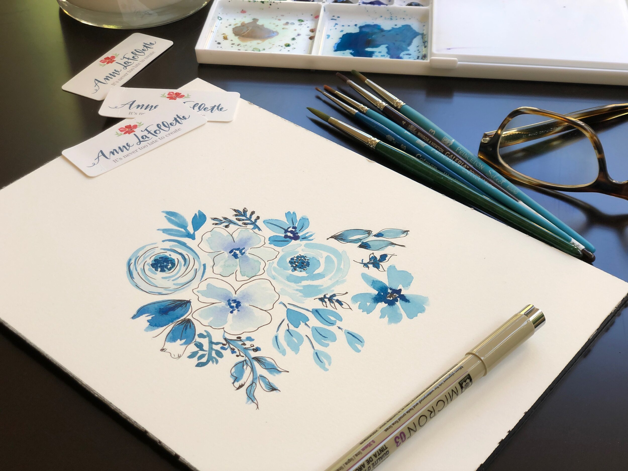
Here is a list of the supplies I’m using but feel free to use your own.
· Hot press 140 lb watercolor paper in a 7 by 10-inch block
· Princeton artist brushes – set of 4
· Sakura Koi watercolor tubes – set of 18
· One jar of water
· Paper towels for blotting
· Micron fine liner pens – set of 10
Let’s jump right in. You can watch the video tutorial and also follow my step by step process as described below.
I start with a very watery blue for my first round rose and then add more pigment for my second large flower which is an imaginary pansy. I love to add a little darker paint to the very center of the pansy and watch the color expand outward in a beautiful organic manner. This is called a wet on wet technique and takes some practice.
The key thing to keep in mind when experimenting with the wet on wet technique, is determining how wet you want that first layer of color to be. Sometimes it can be too wet and the second color that you add spreads almost uniformly throughout. Try to wait just a bit so that first layer is dryer and then when you add the darker color, it will spread but not too much. It can be tricky so be patient with yourself and practice.
As I continue to build out my design, I use darker shades of blue and paint a few motifs using the cobalt blue which is quite different from the Prussian blue I used in the first two flowers.
I don’t sketch out my design in advance although that can sometimes be a very good idea! I start with something in mind and work pretty organically from the center outward. Things that are going through my mind are:
· Do I have enough variety of color? Although I’m working in a monochromatic color palette, I still want lights and darks for added interest and depth.
· Do I have large and small elements? Having a nice mix adds variety and helps your eye move around the page.
· How is the overall placement on the page? How far towards the edges do you want your motifs to go and is there a loose sense of symmetry without it being too obvious.
Those may seem like difficult things to keep in mind as you paint but they come with practice, I assure you. Once I’m happy with the overall design, I’ll let the watercolor dry completely. Then I go back in with my micron pen to add additional details.
My style and approach at this stage is to pick a few elements to outline very loosely with the Micron pen. I may add a few highlights here and there. And when I struggle to achieve very fine and delicate watercolor sprigs, I’ll use the ink to add veining or interior details.
Give this a try and join my creative community on Facebook inside our private group called Anne’s Art Club where I’d love to see you post your work.
Remember,
It’s Never Too Late to Create
If you enjoyed this blog please share it with your friends and family. Click your favorite social platform below. And join my email list for weekly creative inspiration and an invitation to our private Facebook group, Anne’s Art Club.
MEET ANNE
Hi…I’m Anne!
My creative inspiration comes from a lifetime of observation. I grew up in Paris on the Place St. Sulpice and walked to school through the Luxembourg gardens. And that was only the beginning… Learn more by watching the video on my About page.


